How to Apply Utilization Data

HOW many people are Doing what activities in What types of SPACE?

FacilityQuest%2Bon%2Btablet%2B%2528dashboard%2529.jpg


Solve immediate problems

“We are experiencing a problem” can turn into, “Let’s take some data for a day or two and see what’s really going on.”

Fact-based conversations facilitate change. Gather data in team-sized chunks that you can act on quickly. Get rapid feedback on workplace experiments and innovations.

Small, and sometimes repeated studies produce data that can make a difference in your response to changing regulatory environments and emotional reactions to safety needs.

Large, comprehensive studies can be the right response for an upcoming decision with major investment.

In either case, it’s good to know the specific goals of for utilization study and to know how to apply the data that you will be gathering.

Visualize your Data, Act on the Results

Start with your floor plans, in whatever state they exist. Overlay with annotations and markup to show current reality. After gathering even a little bit of data, heat maps show patterns and outliers.

In this heat map, observation points are evaluating a circulation space near conference rooms, showing the importance of space never planned for gatherings.

In this heat map, observation points are evaluating a circulation space near conference rooms, showing the importance of space never planned for gatherings.


WHAT TO LOOK FOR IN A UTILIZATION STUDY

The right visualizations tell a compelling story. Scroll through a heat map by hour of day, or compare how work gets done versus where it gets done. Then break it down by department or business unit and compare the differences. Or look at peak utilization to understand the highest demand you have.

Heat Maps

Show average occupancy at various hours of the day, or just show the peak hours. You might not see any "red" utilization on the overall average, but if you look at peak hours and start to see patterns of red, that could help to tell the story about the need for more phone rooms, for instance. to take pressure off of meeting rooms.

Utilization at 8am / 11am / 12pm

Utilization at 8am / 11am / 12pm

Another version of heat mapping is to show population in space, as average group sizes in defined spaces over time. This visualization shows concentrations of people using a space, not simply “if” it is being used at a high or low rate. Meeting rooms are expected to show higher concentrations, but this is a good way to compare meeting rooms, or discover unexpected gathering places.

heat map by population.jpg

Peak use.jpg

Peak Use

Know the peak utilization of a workplace to plan for the highest demand of space resources.


Understand Meeting Rooms by Supply and Demand

Demand can be understood by observing the sizes of groups that gather in any size of enclosed meeting room.

DEMAND Group Size in Enclosed Meeting Rooms.png

Demand can be understood as groups gathering anywhere, whether in a meeting room or not.

DEMAND Meeting Group Size.png

Supply is seen here as the percent of all meetings that happen in rooms of a certain capacity. Use this data to right-size meeting rooms.

SUPPLY Meeting Rooms by Capacity.png

Group size by capacity.jpg

Analyze group sizes by space capacity

Quickly see under- and over-utilized trends based on room capacity. Filter to show specific rooms. As COVID regulations change, modify capacities and see instant results.


Compare and Contrast Activity in Spaces

Show intended vs. unintended uses or behavior differences between space types.

Desk Assigned-Unassigned pie charts.png

Primary Activity By Hour

By gathering data via observers you get to understand “what activities are happening in your spaces.” So you get to “see” when certain activities peak, or whether intended activities are happening where you would expect. You can look at this data over time during the day, or over the week. You can drill down to look at these patterns for one space at a time, or take a big picture view of all spaces, or focus on one space type, like meeting rooms.

Primary activity by Hour.jpg

Or, compare primary activity by department to see variations in focus work like “Computer” and collaborative work like “Meeting.” Departments with higher needs for meetings might require further study to see if those needs are being met by the existing resources. Check out the “Supply and Demand” reports to dive deeper.

Primary activity by dept.png

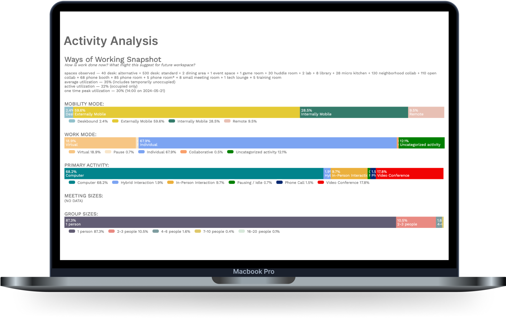
Show the Culture of Utilization: Ways of Working Snapshot

ways of working snapshot.jpg

Generate a quick report for any category of space type (or department or team) that groups together 4 different perspectives of how space is being used.               


Work Mode and Mobility Analysis

Work and Mobility modes.jpg

How often are people who have assigned desks in the office? Do they spend most of their time at their desk? Use this analysis to pair the right resources to the needs of your people.


This chart shows the comparison of work styles by department (pre-Covid).

This chart shows the comparison of work styles by department (pre-Covid).

Space Allocations and Ratios

space ratios.jpg
  • Document the floor area of spaces to show ratios of collaboration space to individual workspace.

  • Report on current state of space uses

  • Report on ratios of square foot collaboration spaces to workstation floor areas.


photo thumbnails.jpg

Photos

Touch a blue dot and take a photo on a walk-around to document a space. Or, observers can take photos while recording utilization, to document actual use.


Calculations

Meeting room right-sizing

Right-size enclosed collaboration spaces to meet current demand. Experiment with potential future states…

 
calculations.jpg

Model Your Options

“How do our meeting rooms and open spaces get used throughout the day? By how many people, doing what activities? When does demand exceed availability?”

With future-state modeling calculators, your current utilization trends can help predict performance of new space configurations. Compare neighborhoods and review workplace scenarios against strategic goals; different ways of working will have different density scenarios and require specialized calculations.

Q&A sessions for interpreting study results: FacilityQuest guides you through the results of your first study; you request assistance as needed in subsequent studies.